A-Corny Logo Alternatives for Collegeboard
OMG! YOU WILL NEVER BELIEVE COLLEGEBOARD’S OFFICIAL BOARD GAME OF SUFFERING!!!!
Name the first thing you think of when you see the acorn on the Collegeboard site. I bet that you’re not relating the acorn to personal growth or development as Collegeboard had intended it to, but instead, you’re thinking of squirrels. Because, look, squirrels eat acorns, right? I mean, what else is there to think of when given such a seed? To say the least, this logo is so poor in its representation that it should be replaced with something infinitely better that personally connects to the student body. Something more… heartfelt and sincere. Hence, I present to you: four other logos that the Collegeboard could use.
A Sandal: Starting off strong here, we have a normal household item. Now, before you decide, “Hey, this sucks, what in the world does a sandal have to do with anything?” and stop reading the article, I simply want to say that this is a pretty strong logo. Does it not remind you of the wrath of your mother when you score under a 1600 on the SAT? That’s right! It’s the sandal of DISAPPOINTMENT. I propose that, if this logo is to be implemented, students would be motivated beyond their parents’ wildest dreams to score a 1600+. When Collegeboard prints this on all those lovely test booklets, anxious students will become even more traumatized once after laying their eyes on that sandal lingering at the corner. And voila! Collegeboard has successfully done its job.
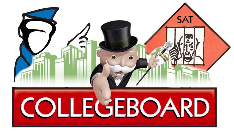
Monopoly Logo: Whoever knew SAT tests cost like $55? Per attempt? It’s definitely a huge amount of money to pay for such a test. Collegeboard builds itself off of students’ money doesn’t it? That 501(c)(3) is looking pretty hot right about now. So where exactly does Monopoly fit into all of this? Monopoly, as we might know, is a game that teaches its players about capitalism and hoarding money until other people go broke. Sounds like an organization we know, but I can’t really put my finger on it. Also, Collegeboard is a literal board game. Get it? CollegeBOARD. A board game that plays with students’ stress levels. What better logo could there be other than the Monopoly one?
A Credit Card: If Collegeboard doesn’t agree with the Monopoly logo, then what about a credit card? It’s an easy, minimalistic logo that can be drawn with approximately four lines and accurately depicts their ability to take money from students. The first 16 digits represent the number of students who have suffered in SAT cram schools, and the 3 numbers on the back symbolize the score achieved after months of hard work! After all, Collegeboard is as much a nonprofit as Amazon is. And the logo would even also fit perfectly between the two L’s of the word “Collegeboard” as if it was meant to be there. I don’t know about you, but this seems like a pretty solid plan.
A Negative Parabola: Lastly, here we have a standard trigonometry graph that students know. It depicts the rollercoaster your stomach does when you flip to the first page of the booklet as the test begins, and represents the score as students progress through each section. From the first reading section to the last math section, you’ll definitely feel as though you’ve done better on the middle parts. But by the end of it, you’re sure that your score has gone way down, especially when you realize that you’ve made grievous errors at the end of it all. Thus, your feelings about your score are shaped like a negative parabola because it can only go down from here. Not to mention, the parabola also reminds students of a frowning face, spreading all that positivity (not that there was much to begin with…) once they go home and cry about how much they messed up.
With that said, go forth, my children! Go send a plethora of emails and letters bombarding Collegeboard to change their useless logo! Let us be free of acorns!


